A few weeks ago, we ran user research sessions with product managers from some major companies.
None had used Bonboarding before.
Their task: create your first product tour using our no-code editor.
What Happened
Every participant could build a working product tour. Phew 😅
They also liked the tool.
But we found the real gold in the moments when they paused.
There were recurring friction points where they hesitated, where they had to think twice.
These showed us exactly where to improve our product tour builder.
So we jumped on improving them, starting with some of the lowest-hanging fruits:
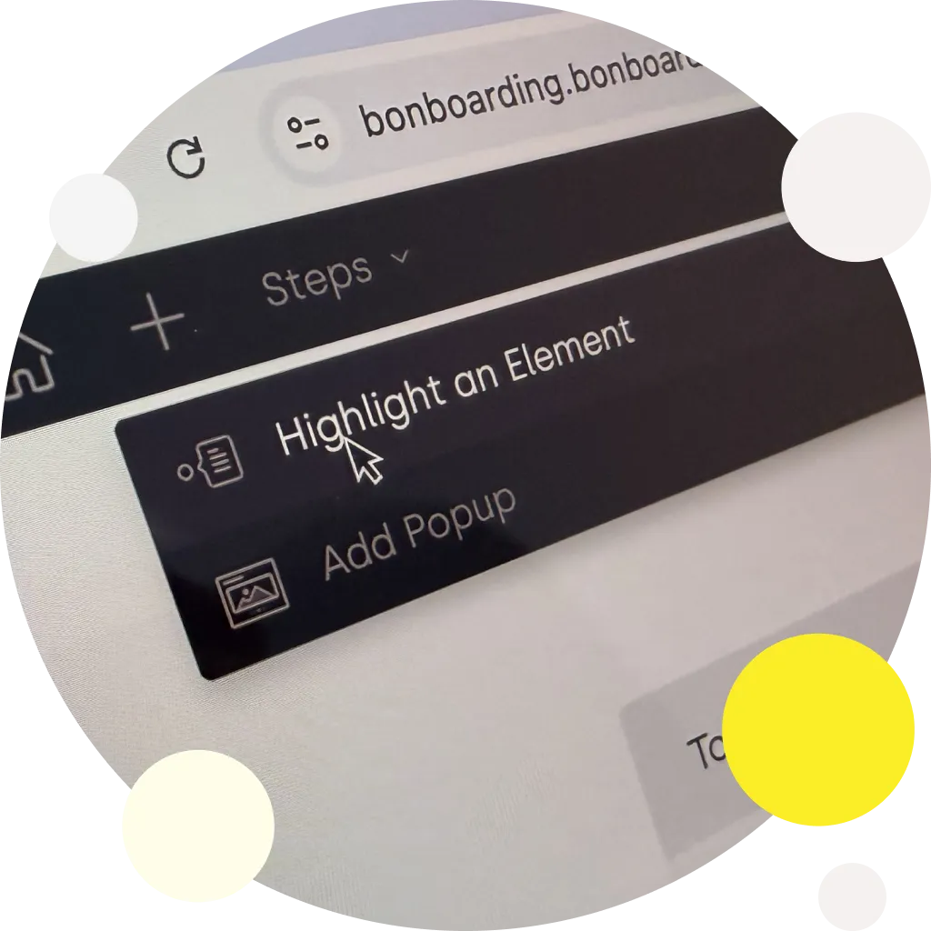
1. Confusing Icons
Even with tooltips, users couldn’t figure out our step-addition icons.
They hovered. They clicked randomly. They guessed.
When users guess, you’ve lost.
We fixed it by adding a universal Add button.
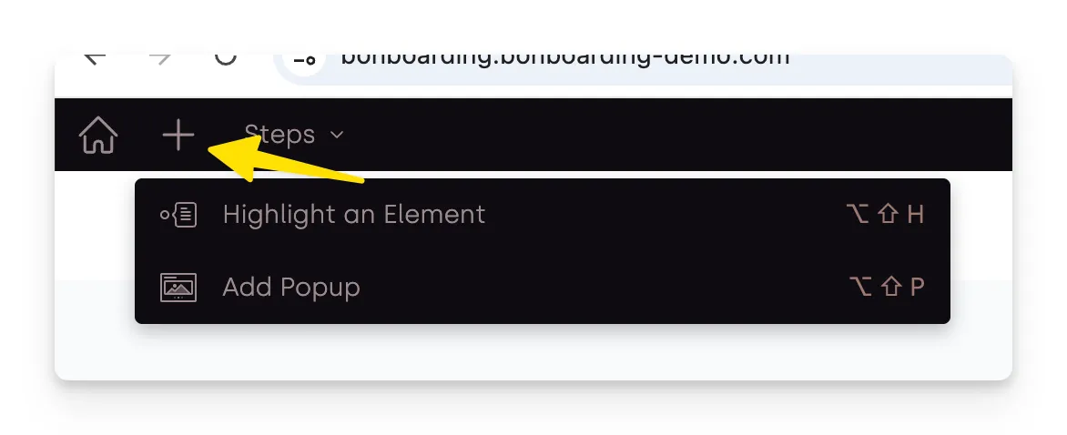
This ”+” button labeled “Add Step” opens a dropdown list.
Each option now has clear text labels, so our users don’t have to play guessing games.
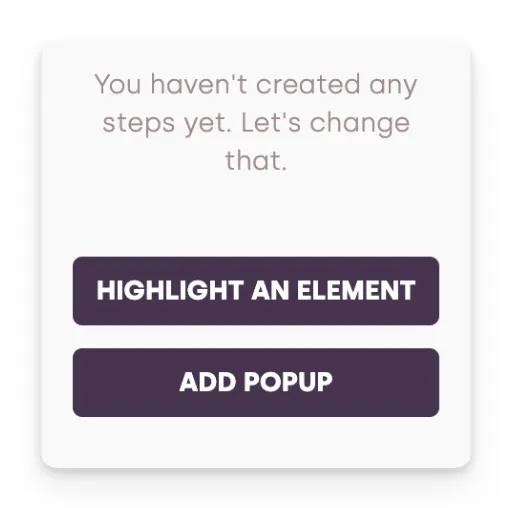
2: Empty State Paralysis
Starting with no existing steps confused people.
Where do I begin? What should I click first? They kept opening and closing the list of steps, which was empty with no explanation.
Empty states need clear starting points.
Step creation options are now available from this list, even when there are no steps yet.
We also added some explanations to show, what can they expect there, once they started creating their product tour.
3: Save Anxiety
Users were worried about losing their work.
Our auto-save worked perfectly. But they didn’t know that.
Users need to see what’s happening behind the scenes.
So we added a straightforward “Saving…” indicator which appears every time when changes happen.
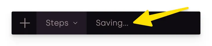
Now users know their work is safe.
4: Navigation Mystery
The link back to the main app wasn’t obviously placed.
Users spent time looking for the way home - except, there was no “Home” icon. We used the Bonboarding logo instead (with a tooltip, to show the functionality, but that was not enough).
Clear navigation shouldn’t require thinking.
We changed the icon to the universally known home icon that everyone recognizes.
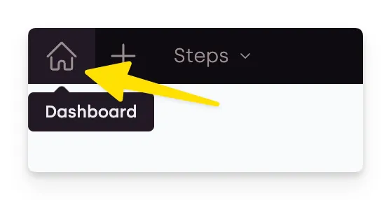
It removed confusion immediately.
Why Small Changes Matter
These fixes might look tiny. But they add up.
Each removed friction point helps users succeed faster.
Product managers know this truth: user adoption lives in the details.
When your team picks user onboarding software, every small hesitation costs you adoption.
What We’re Doing Next
This research opened our eyes to more opportunities:
- Testing our targeting features with real product teams
- Studying how teams actually use onboarding tools daily
- Making setup easier for developers
- Adding more customization for brand consistency
And of course, shipping many more improvements to make Bonboarding the best and easiest product tour creator software.
The Lesson for Product Teams
User research shows you truths that analytics can’t.
Watch where users pause. Those pauses are your improvement opportunities.
The friction points might seem obvious after you find them. But they’re invisible until you watch real users struggle.
Schedule regular user testing sessions. Pick users who haven’t seen your product before. Give them realistic tasks.
Don’t guide them (it’s the hardest, I know, to just sit there with a poker face and see others trying your product).
Don’t explain. Just watch.
You’ll find problems you never knew existed.
Want to try our improved editor? Start building product tours for free.
Have feedback about onboarding tools? We want to hear it.