Overwhelmed by the different product tour creator software out there? Fear not!
This comprehensive guide lists the 10 essential features to look for, ensuring you select a product tour tool that precisely meets your needs, enhancing user engagement and smoothing the onboarding journey.
No matter if you’re a product manager, UX/UI designer, onboarding guru, SaaS company bigwig, or a customer success champ, the aim is to guide you, so that you make the right choice.
User onboarding isn’t just a side note, it’s core to any software product or service. It shapes the user’s entire journey and is pivotal in ramping up user happiness, keeping them around, and in the big picture, scoring business wins. With the right user onboarding tool, you can guarantee your users a smooth and joyful experience from the get-go.
So, let’s deep dive into the first few must-have features in a stellar user onboarding tool.
1. Welcome Message
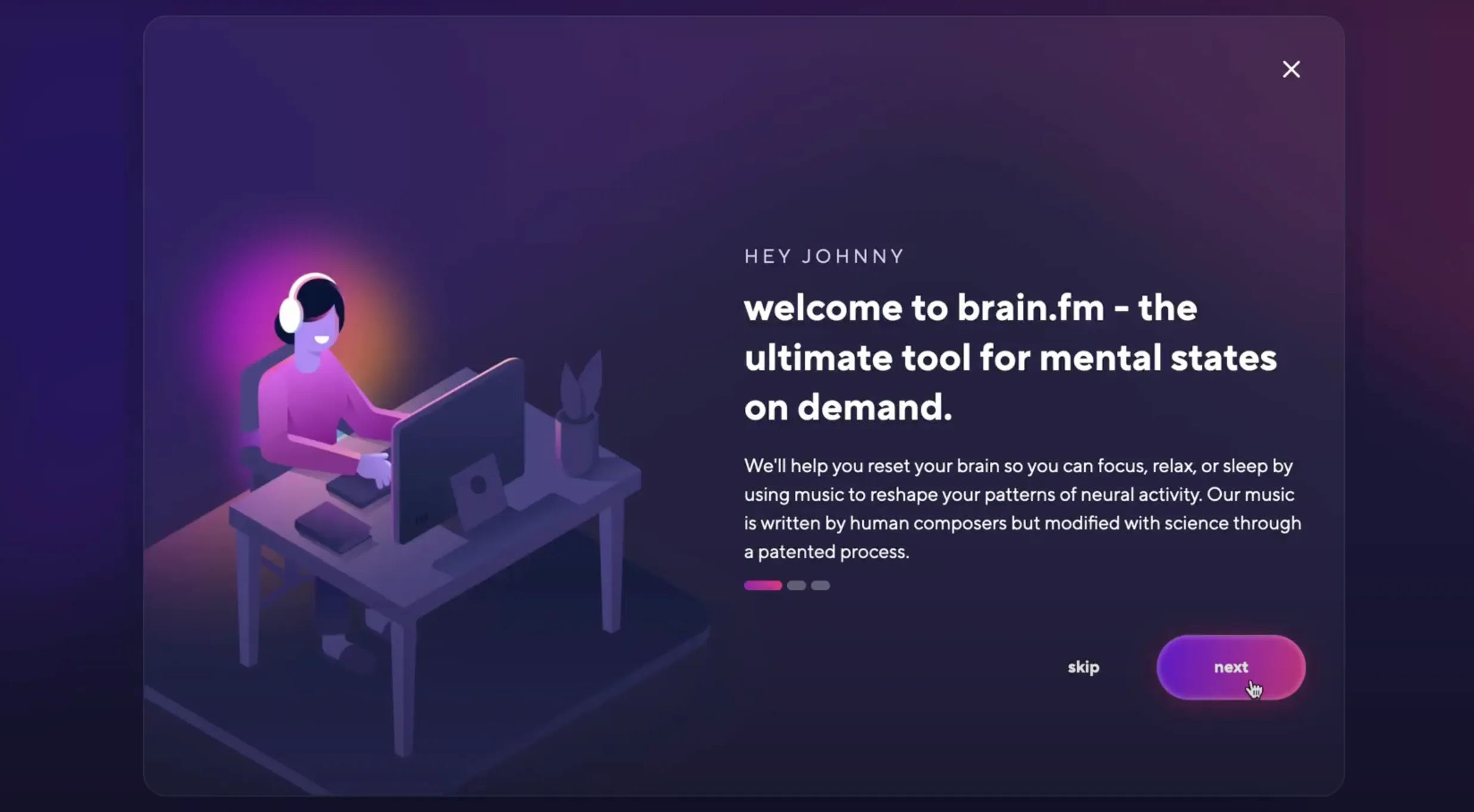
The welcome message is akin to the opening lines of a show, setting the stage for the user’s journey. It’s your chance to convey your product’s value proposition in a nutshell.
A warm greeting, coupled with a succinct pitch of your product’s benefits can spark user engagement from the outset. The aim is to craft a message that’s friendly, brief, yet sufficiently compelling to highlight the promising outcomes users can expect to achieve.
Visualize a user signing up for a project management platform. A captivating welcome message might go like this: “Welcome aboard! With our platform, wave goodbye to chaos and say hello to seamless team collaboration, streamlined project tracking, and a smoother route to achieving your milestones. Ready to embark on this exciting journey?”

2. Virtual Product Tours
Next on the list are product tours.
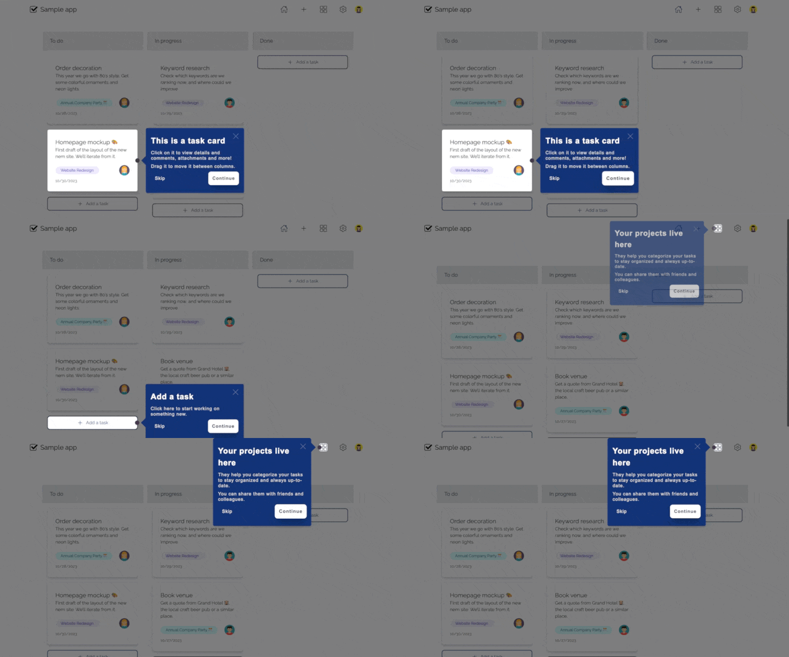
These are your user’s virtual companions, guiding them through the key facets of your product in an interactive, step-by-step manner.
It’s about offering a friendly walkthrough, ensuring users don’t feel adrift in a sea of features.
Through guided tours, you highlight the cornerstones of your product, elucidate their value, and demonstrate how they can alleviate the user’s pain points.
Take for instance, a project management tool.
A well-structured product tour could shepherd users through the processes of creating projects, allocating tasks, and monitoring progress, ensuring they grasp the core functionalities swiftly and effortlessly.

3. Progress Bars
From products tours, you transition to the third feature, progress bars.
These visual aides are excellent for providing an encouraging snapshot of the user’s onboarding journey. They illustrate the extent of completion, instilling a sense of achievement and spurring users to tackle the remaining tasks.
Progress bars provide a clear roadmap for users, making the onboarding process less daunting and more engaging.
Picture a scenario where a progress bar cheerfully indicates a user has breezed through 50% of the onboarding tasks, visually nudging them to continue the adventure.
This simple yet effective feature keeps users in the loop, motivating them to see the onboarding journey through to the end.
4. Checklists
Transform onboarding into a clear, doable roadmap with checklists.
They break down the onboarding journey into bite-sized tasks, making it easier for users to track their progress and know what’s next.
Imagine a checklist nudging users through profile setup, feature exploration, and customization options.
As users tick off tasks, they ride a wave of accomplishment, pushing them forward.
Checklists in a user onboarding tool spell out clear action steps, ensuring users don’t skip crucial setup tasks and quickly find their footing within the product.
5. Hotspots
Hotspots are your product’s spotlight, illuminating key features or areas that users should explore. They invite interaction, enticing users to delve into the functionalities that matter.
Picture pulsating beacons drawing users to essential features.
A click unveils a wealth of information or a step-by-step guide, demystifying a particular feature.
By sprinkling hotspots throughout the user interface, the onboarding tool makes the discovery journey intuitive and engaging, ensuring users aren’t missing out on what’s crucial.

6. Action-Driven Tooltips
With action-driven tooltips, help arrives right when users need it.
As users interact with features, contextual tooltips swoop in, providing useful tips or explanations.
Visualize a user hovering over a feature, and a tooltip pops up, shedding light on how to make the most of that feature.
It’s about easing the user’s path, reducing friction and the learning curve.
Incorporating action-driven tooltips means your onboarding tool is equipped to offer real-time guidance, making the user journey smoother and less daunting.
7. Persona-Based Onboarding
Ditch the one-size-fits-all approach. Tailor the onboarding journey to resonate with different user personas. By aligning the onboarding process with user roles or preferences, you make the first interaction with your product more relatable and engaging.
Take a SaaS platform catering to both solo users and big enterprises. A few smart questions at the onset can distinguish between them, tuning the onboarding pathway to match their distinct needs.
By tuning into the user’s goals and pain points, persona-based onboarding paves the way for a meaningful and personalized user experience, heightening satisfaction and fostering long-term user relationships.

8. Engagement Enhancing UI Patterns
The user interface is your onboarding playground. Spruce it up with intuitive layouts and interactive snippets to hold user attention and ease the navigation.
- Videos & gifs: Bonboarding supports both videos and Gifs to enhance your users experience.
- Personalized messages: You are able to mention the user’s name with placeholders.
- Visual cues: Direct user attention to crucial features or actions with visual indicators.
- Clear navigation: Keep the onboarding journey well-signposted and easy to navigate, so that users never get lost.
By knitting these engagement-centric UI patterns into the onboarding fabric, you craft a visually appealing, user-friendly experience that beckons users to explore further.
9. Continuous Improvement
Onboarding isn’t a set-and-forget affair. It’s a canvas for continuous improvement to keep up with evolving user expectations and product enhancements.
- A/B testing: Split-test various onboarding flows to distill what works best for different user segments.
- User surveys: Post-onboarding surveys can unveil user pain points, providing actionable insights to refine the onboarding journey.
- Onboarding metrics: Keep an eye on metrics like user activation rate or time-to-complete onboarding to unearth bottlenecks and optimize the journey.
By embracing a cycle of testing, feedback, and iteration, you ensure the onboarding process stays fresh, effective, and aligned with user needs.
10. User-Level Insights
A superior onboarding tool isn’t just about guiding users, but also about learning from user interactions to continuously refine the onboarding experience.
Delve into analytics to spot the bottlenecks in your product tours and understand where users might be facing challenges.
Being able to track user-level history allows for a deeper understanding of individual user interactions and adoption paths.
This treasure trove of data is crucial for identifying areas of improvement, ensuring that your onboarding process is not just instructive, but intuitive and enlightening.
How Bonboarding Boosts User Onboarding
User onboarding is the embarkment point of a user’s journey with your web app.
It’s where engagement begins and adoption takes root.
Bonboarding shines in this domain, offering features designed to make onboarding a breeze.
We provide easy solutions for all the features mentioned above.
Effortless Customization
- Bonboarding’s no-code customization is a dream for product managers and UX/UI designers. Tailor the onboarding journey seamlessly, without writing a line of code.
- It automatically detects your page’s styles so you can forget about searching for HEX color codes and fonts.
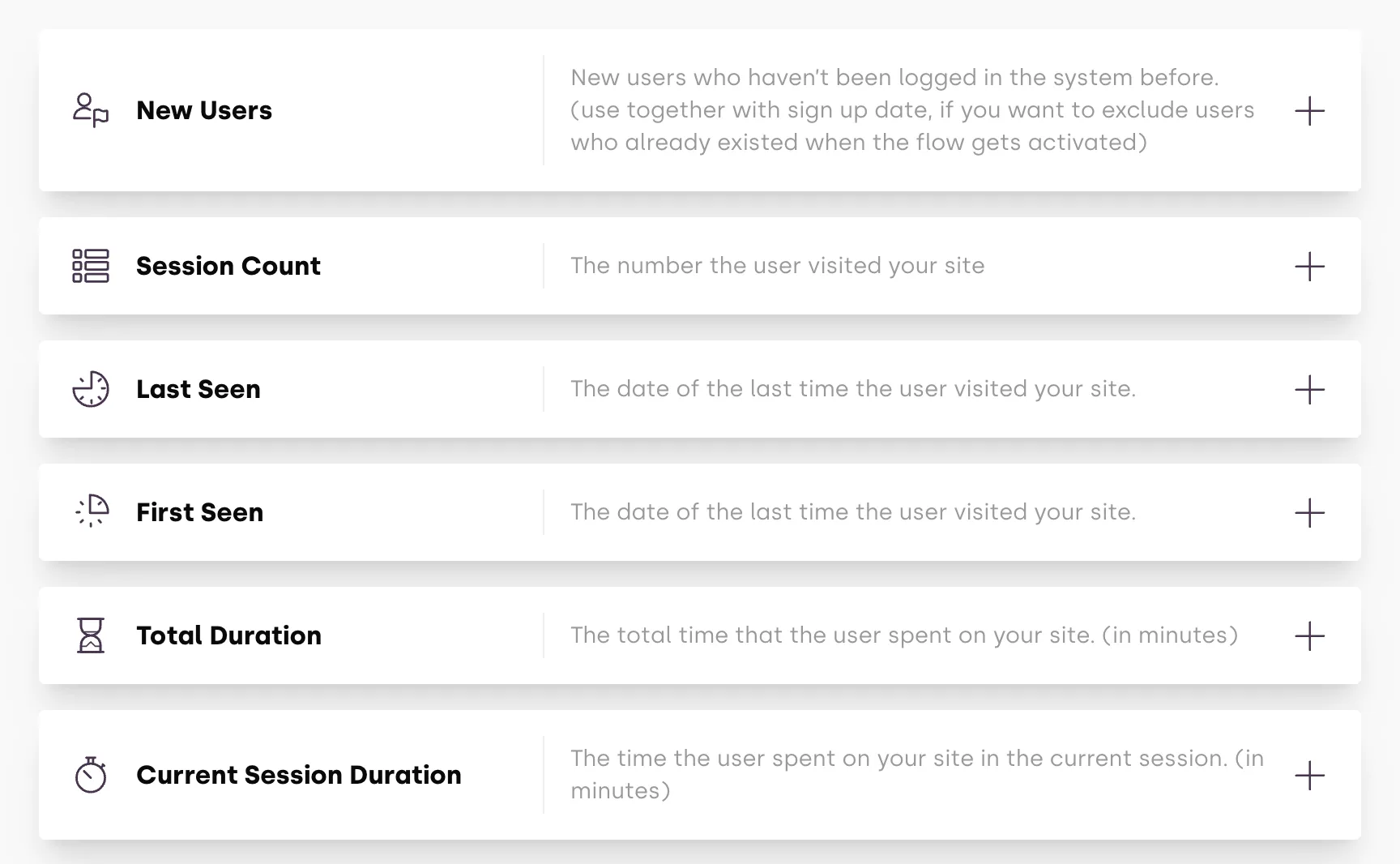
- Target specific user segments for a personal touch, making the onboarding resonate with each user type.
It’s not just about understanding the app, it’s about feeling at home while getting to know it. We ensure users feel like they’re being addressed directly. - Explore Bonboarding’s customization features.
Guided User Navigation
- Bonboarding doesn’t just onboard; it guides. From the first click, interactive walkthroughs take users by their hand, unveiling features step-by-step.
- On-demand help is at your fingertips, anytime confusion strikes. Immediate clarity, that’s what Bonboarding brings to the table.
- Discover how Bonboarding facilitates user navigation.
Real-Time Engagement Triggers
- React to user behaviour in real-time. Bonboarding’s engagement triggers customise the onboarding experience on the fly, making every interaction count.
- As soon as a user’s interest in a particular feature is registered, Bonboarding swoops in with focused onboarding content, enriching user understanding.
- Uncover real-time engagement with Bonboarding
Insight-Driven Improvement
- Beyond onboarding, Bonboarding is your lens to user interaction. Dive into analytics, get actionable insights.
- Every bit of user behaviour data is a cue for improvement, helping tailor a smoother, more enlightening onboarding process.
- Delve into insights with Bonboarding.
Bonboarding isn’t just an onboarding tool; it’s your partner in crafting impactful user onboarding experiences.
Customization, guided navigation, real-time engagement, and insightful analysis; it’s all geared towards one goal: making user onboarding not just engaging, but effective.

